
Graphic design has become more than just being visually attractive; it has evolved into a tool that businesses use to create a perception about themselves and to communicate their value to potential clients. The design industry has also changed from relying on visual appeal alone, to now creating an experience, which allows consumers to engage with their brand through both digital and physical means. Graphic design also plays a vital role in attracting new customers to a business, as it communicates that a business can be trusted and provides a quality service. The continued growth in technology and development of consumer habits will continue to shape how graphic design develops and what trends will be popular in the future.
By 2026, graphic design will continue to trend toward creating experiences for the end-user and less on design itself. In addition to providing excellent service, brands will need to create an emotional connection with their customers through the design they use, how they function as a brand, and thus communicate value-based upon that connection.
As graphic design trends evolve, they are responding to many cultural changes such as evolving digital behaviors and a stronger emphasis on sustainability. The graphic design trends of 2026 are not just fads; they indicate much deeper changes in the way brands visually communicate in an ever-increasingly crowded digital environment than what has existed in recent years. For companies that choose to ignore these trends, the risk exists of being perceived as outdated or generic, as well as being disconnected from the needs of their market.
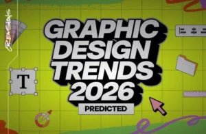
In this blog, we will highlight 10 graphic design trends anticipated to continue to shape 2026. For each trend, we will summarize what each trend is about and what companies need to do to adapt their brand’s visual identity to maintain, and further develop, the emotional connections and competitiveness of brands within the more digitally focused world.
-
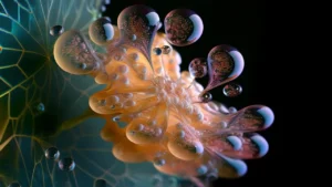
Hyper-Real Illustrations with Human Imperfections
Embracing Authenticity
As we blossom into 2026, the illustration style is transitioning from the clean and precise look of illustration to feel more natural and organic, with human attributes. There is a growing trend of hyper-real illustrations that are purposely created to have intentional imperfections, as being easily identifiable allows us to create emotional authenticity in our work. There are several ways to create hyper-real illustration, including varying line weights as well as adding texture to give a natural grainy look, and adding hand-drawn elements, as well as using light or creating the illusion of it. These techniques allow us to mimic the imperfections found in the real world.
Designers are choosing not to create perfect images. Instead, they choose to create an honest representation of their work. Many audiences today are not as accepting of overly synthetic visual representations, which is why hyper-real illustration has so much value. Hyper-real illustrations can convey a sense of craftsmanship and creativity, making them an excellent way of telling your story.
Applications Across Platforms
This type of illustration can be found everywhere: editorial layouts, brand websites, digital campaigns, and packaging. They provide brands with a way to express emotion and depth without having to rely on generic pictures or stock visuals. For example, a lifestyle brand might use illustrations with a slight imperfection in them to look authentic; fintech or corporate brands may use these types of illustrations to humanize an otherwise technical or abstract idea.
Hyper-realistic illustrations can also be animated or layered into an interactive digital format through web design (with subtle hand-drawn transitions, for example). The result: increased user engagement. Because they appear more “human” and approachable, these illustrations tend to perform well on social media when compared to more traditional or highly-polished visuals.
Strengthening Emotional Connections
For companies seeking to build a relationship with their target market, this trend will likely help build trust. Illustrations with slight flaws indicate a company’s honesty and authenticity, which are two highly valued attributes by today’s consumers. Using this reflection of your brand will make it seem more relatable and human, ultimately creating a stronger emotional bond between the company and its audience. You can also integrate these types of illustrations into your social media posts, presentations, and advertising, as you will see improved audience engagement and memorability. In addition, a hybrid visual design experience utilizing both illustrations and photography/videography will give consumers the feeling of an authentic, intentional image.
-
Modular Typography Systems

Flexibility in Design
Typography in 2026 is not static anymore. Modular typographic systems are increasingly an essential part of contemporary brand identity. Brands that don’t confine themselves to a single typeface are building their own flexible typographic systems that can be moved around and flowed seamlessly across various screens and platforms.
It enables typography to scale, space, align and layout according to the content context. In the end, typography could span content across screens, animate subtly or reconfigure for different formats such as webpages, social media posts, dashboards and motion graphics. This versatility makes sure that messaging is readable, aesthetically pleasing and impactful on any medium.
Supporting Multi-Platform Branding
This trend represents how brands are engaging on multiple fronts. Each of its components is modular to retain a visual coherence, but have as much creative range as possible. They also improve readability and device compatibility (a priority as mobile use grows). Designers use variable fonts, responsive typographic grids and systemised scale hierarchies to realise this modular approach.
Enhancing Brand Recognition
For brands, modular typography allows scalability. Advanced typography with digital businesses ever increasing, expandable typography keeps content harmonious while still allowing original design. It builds brand presence all while being transferable to new platforms. For instance, a linked type system might grow or shrink in size on various screen devices while maintaining a level of visual equilibrium and readability. Brands might also incorporate motion with type animated headers or typographic elements in video campaigns that gives text greater visual depth and personality.
The development of modular typography is also related to a bigger trend towards personalized branding. By manipulating type across touchpoints, brands can still retain a distinct visual voice while adapting experiences for different audiences or platforms.
-
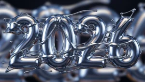
Liquid Chrome Soft Metallic Graphics
Fluid Futuristic Design
Design features in metallic from an era gone by are enjoying a renaissance this year. Far from harsh, metallic chrome finishes are replaced with liquid chrome and soft metallic looks that feel flowing, futuristic and fresh. These visuals are usually more as smooth gradients with faint reflections than harsh highlights.
Liquid chrome typography and details provide depth and sophistication without adding unnecessary clutter. These are typically used with neutral below-the-line applications for balance and maintain clarity. The result is somewhat futuristic but friendly and elegant – and a little bit feely, like technology should be.
Ideal Applications
This technique works particularly well for technology, fashion, car and luxury service brands. Metallic aesthetics represent advancement and futurism while upholding a sense of gracefulness. Brands that utilize this trend can visually signify a company as being forward-thinking and new-age, thus gaining more appeal to tech-savvy or design-aware consumers.
Combining with Motion and 3D
For companies, this movement represents quality and creativity. When employed in a strategic manner, metallics are able add interest and communicate premium without feeling overly garish or old-fashioned. Great for product packaging, app interfaces, and digital ads looking to express sophistication. What’s more, designers are blending the liquid chrome aesthetic with 3D visuals and motion graphics to give it a convincing sense of depth and interaction – which really captures attention effectively. This method enables arriving at luxury and modern, catering to the audience looking for aspirational as well as relatable experiences.
-
Retro-Future Design Aesthetics

Nostalgia Meets Innovation
A fusion of retro-futuristic aesthetics and modern design principles and execution. In 2026, we’re seeing styles reminiscent of past predictions for the future such as neon color palettes, grid layouts and digital early aesthetics. These are mixed with modern typography and usability standards.
The result is a design that’s familiar yet innovative. Retro-future graphics stirs feeling and interest, staying neat and functional at the same time. For instance, neon pops of color paired with a stripped-back design can be used to make for an arresting digital storefront or app interface technology that feels futuristic and familiar at the same time.
Storytelling Through Retro-Future
This is trendy in branding, digital advertising and creative industries where the visual story telling is key. It helps a brand stand out while remaining culturally relevant and appeals to consumers who love nostalgia but still require modern functionality.
Emotional Resonance for Brands
Retro-future aesthetics are powerful for brands. “They play into nostalgia with a forward-looking identity, and they are able to drum up excitement among younger, more tech-savvy users. It’s a trend that fashion and entertainment companies, as well as tech groups, can particularly capitalize on. Retro-future motifs can also be leveraged by designers for event branding, social campaigns and limited-run products, marrying digital prowess to cultural storytelling in order to command attention and invite a dialogue.
-
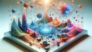
Immersive 3D Design Elements
Creating Depth and Engagement
Although now it is becoming a new normal, in 2026 three-dimensional design has been already implemented into digital branding. Designers are making use of ways to add stroke, lighting and perspective etc in order to make the visuals more visually immersive. Even a few 3D elements can add an extraordinary element of interaction and dynamism to your visuals.
Practical Applications
3D graphics are deployed in websites, apps, product showcases and interactive storytelling. They are useful in directing a user’s attention and offering something more realistic than flat images. We can repeat that pattern here with 3D in WebGL, AR or VR which allows for more interactivity and engagement than simple raster images even on the regular screen.
Enhancing Brand Experience
For brands, 3D design increases engagement and recall. It enables businesses to visually convey complex stories and deliver more compelling user experiences that make an impression. Product visualizations or motion graphics in social media, 3D content creates an interactive component which holds the attention longer. In e-commerce, 3D product views give customers the opportunity to examine a product as if they were holding it in their hands, which builds more trust that a customer is getting what they are paying for. Likewise, company presentations utilizing 3D infographics can break down hard-to-digest information in an eye catching manner.
-
Ultra-Minimal Line Art with Emotion
Evolving Minimalism
Minimalism has come a long way in 2026. The super-minimal line art is contrasted with emotional depth within the organic shapes and mellower compositions. Designers are abandoning rigid geometry in favor of flowing lines and gentle imperfections that provide warmth and personality.
Application Across Industries
This keeps things simple, but won’t make anything look cold or sterile. It’s widely used in branding for wellness, education, and professional services industries that rely on clarity, approachability, and calm. By combining minimalism & emotion together, line art lets you tell a story from which people encourages sustained engagement.
Storytelling Through Simplicity
Minimalistic line art that lets content breathe, yet is still filled with personality. It’s creative, but doesn’t bog down the visual narrative. By blending simplicity with storytelling detail, brands are able to communicate powerfully in web and print as well as on-screen. It’s a technique that transfers across to iconography and infographics too — clarity and simplicity, but personality can still shine through.
For brands, that trend implies a sense of peace, confidence and authenticity. It contributes to a clean, modern look that feels present and emotionally connected and which ultimately makes the audience feel more. Adding in simple animation to line art can also enhance engagement without using too much, keeping the minimalist feel.
-
Motion-First Branding System
Motion as Core Design
In 2026 motion has finally become an integral part of brand identity. Brand-after-effect is when animation is core to the design and not an add on. Logos, type and interface elements are conceptually sketched to fit naturally into movement.
Enhancing Usability
Animation learning guides the user and gives feedback to improve usability. It also adds a touch of engagement, especially on social channels – where motion is more arresting than static imagery. So can those gentle fades and scrolling infographics, not to mention the feedback loops we set up for ourselves.
Dynamic Brand Recognition
This should not be a surprising move, given how content is being consumed by today’s audiences. Static imagery is no longer sufficient to differentiate in rapid digital environments. From the motion-first brand down to every touchpoint, we make sure that you feel dynamic, fluid and modern. For brands, motion-centric systems enhance recognition and recall. They design dynamic experiences that are modern and intuitive. Tech, media, and retail companies in particular can gain a lot by transforming their functional components into images or animations that feel active and alive.
-
Sustainability-Driven Visual Design
Eco-Conscious Aesthetics
Sustainable transformation is still a driver for visual appearance in 2026. Brands are showing an environmental conscience in design and not just words. Neutral color schemes, natural textures and minimalist designs embody our eco-friendly ethos.
Aligning Purpose and Design
This movement connects a visual identity to brand purpose. Nowadays, consumers demand the real thing and visual design is key in representing a company’s ethical approach. Eco-design actions such as recycled packaging, Sustainable born-digital actors, responsible printing make the brand credible.
Building Trust and Emotional Alignment
Eco-friendly design is about no excess but lean on clarity, intention and responsibility. It makes visuals that are down-to-earth, moraled and relatable (in a good way) for socially conscious markets. For businesses, this trajectory also fosters trust and emotional alignment. Socially responsible consumers respond more favorably to brands that visually communicate their sustainability ideals.
Sustainability in visual storytelling can be an individual brand’s competitive differentiator and support long-term responsible actions. Examples of this approach include reduced packaging, zero-waste print campaign and digital first design strategy including lower use of materials.
-
Softened Neo-Brutalism
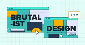
Bold Yet Refined
Neo-brutalism still has a following in 2026 but the style has been cleaned up. Designers are finding ways to take bold type and high-contrast imagery on one side of the scale, matched with typography that is more readable, accessible and better spatially organized on the other.
Improving Usability
Neo-brutalism is softened, but the visual sting remains in a user-friendly form. Thoughtful spacing, hierarchy, and visually clarity are leveraged throughout so that the bold visuals do not take over the user. This technique gives an air of confidence combined with accessibility, ideal for editorial design, portfolio’s and experimental branding.
Dynamic Visual Identity
For brands, neo-brutalism serves as a way to break through visually. It gives a very bold message without compromising readability and functionality. Companies may leverage this design for campaign websites, creative agencies and media websites that want the strong visual branding that can easily be remembered by users. However, designers are also striving to blend neo-brutalism with movement and interactive design for a more dynamic yet controlled experience.
-
Mixed-Media and Layered Visual Storytelling
Creating Depth and Dimension
Photo-illustrative, type-driven and ornamental design come together in mixed media format into this layered style of artwork. In 2026, it allows for richer storytelling, deeper engagement and emotional resonance.
Engaging Audiences Visually
Layered graphics add depth, contrast and a touch of sparkle. They feel homegrown and personality driven, which works well for campaigns, editorial content & social storytelling. But combined with digital processes, analog offers designers the ability to create arresting visuals that break through busy feeds and fast-paced experiences.
Enhancing Brand Narrative
For brands, mixed-media design has the effect of strengthening storytelling. It’s attention-grabbing, drives people to engage more with content and develops a multi-faceted visual language. The retail and lifestyle entertainment brands can capitalize on this trend most – layers of stories that can relate to different audiences. By adding some gentle animated or interactive details to the mixed media compositions will increase engagement.
Conclusion
The 2026 graphic design trends reveal a move toward deliberate experience-based visual language. Design is not just a matter of appearance anymore. It’s all about feeling, usefulness, reality and a sustainable brand strategy. No matter whether featuring human-centered illustrations and modular typography, immersive 3D visuals, or sustainability-driven design, these trends highlight what it takes to adapt as a brand.
Embracing these trends doesn’t mean you have to heedlessly follow each one. What brands should do instead is to drape estimated design decisions over our values and audience expectations/business goals. Intelligent design choices equate to stronger brands, higher engagement and concisely emotional relationships.
Here at Creasions Digital, we think that graphic design should articulate growth, understanding and truth. With 2026 being only a few years away, those brands that have invested in design that is purposeful, strategic and experience-driven will be the ones thriving in an evermore crowded market. By embracing these trends in careful moderation, businesses can make visuals that are both stunning to look at and impossible to forget—functional as well as valuable to their users’ interests.
Leave a Reply